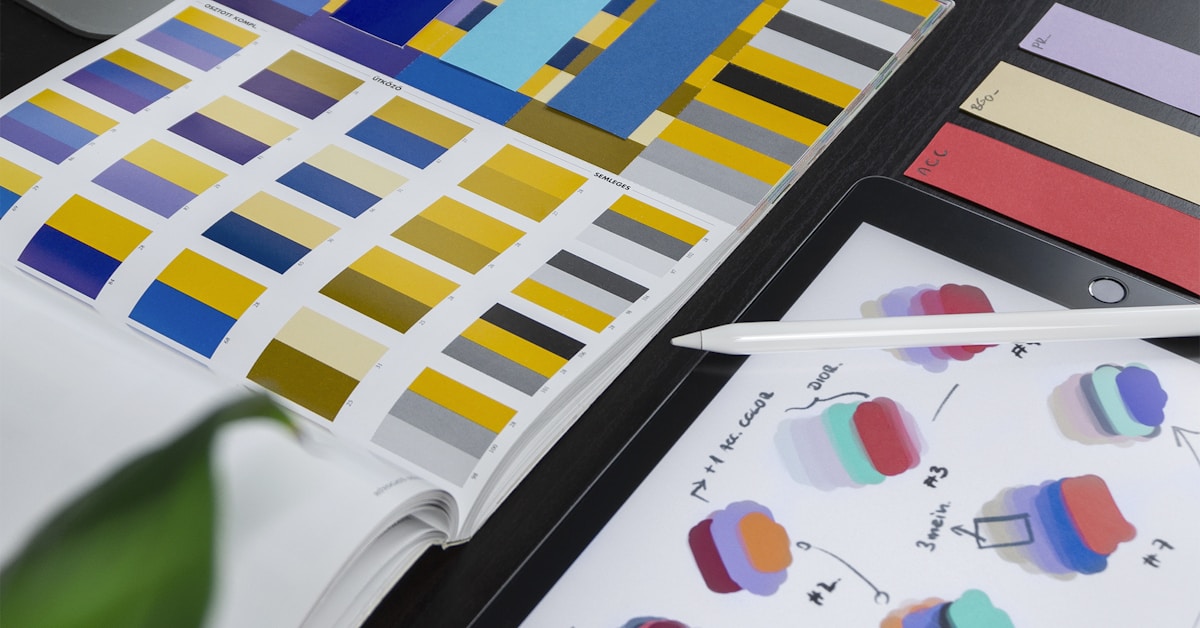
Color is the fastest form of communication in design. Before a user reads a single word, they’ve already formed an emotional response based on your color palette. Understanding color psychology isn’t about manipulation — it’s about designing experiences that feel intuitive and aligned with your brand’s promise.
Why Color Matters More Than You Think
Research consistently shows that color increases brand recognition by up to 80%, and that users form a visual judgement about a product within 90 seconds — with 60-90% of that assessment based on color alone. Getting your palette right is one of the highest-leverage design decisions you can make.
The Emotional Language of Colors
Blue — Trust, stability, professionalism. Dominant in finance (Barclays, PayPal), healthcare (Philips, NHS), and technology (Facebook, Twitter). When in doubt, blue communicates competence.
Green — Growth, health, sustainability, money. Natural and positive associations. Effective for eco brands, finance (growth-oriented), and health/wellness products.
Yellow/Lime — Energy, optimism, innovation. High visibility, commands attention. Used by brands that want to stand out as bold and forward-thinking (our own #C8F31D is a confident statement).
Red — Urgency, passion, appetite. Creates psychological urgency — that’s why sale tags and CTAs are often red. Use strategically; overuse causes fatigue.
Black — Luxury, sophistication, authority. Dominant in premium markets. Dark backgrounds with accent colors signal premium positioning.
Color Contrast and Accessibility
Beautiful color combinations mean nothing if users can’t read them. WCAG 2.1 requires a minimum contrast ratio of 4.5:1 for normal text and 3:1 for large text. Our design process includes accessibility audits at every stage — not as an afterthought.
Building a Palette Systematically
Professional UI color systems aren’t built from aesthetics alone — they’re built from function. A well-structured palette includes: primary brand color, secondary accent, neutral grays (5-6 steps), semantic colors (success green, error red, warning yellow), and dark/light surface variants.
Color in Context: Dark vs Light
Dark mode isn’t just inverting colors. Dark interfaces require different saturation levels, more carefully calibrated contrast, and often warmer dark backgrounds (not pure black) to avoid the harsh “cave wall” effect. Our UI/UX team designs both modes from the ground up, not as afterthoughts.
Want a UI/UX design that communicates your brand with precision? Explore our design services.